




The brief
Starface launched in 2019, founded by Julie Schott, a former Elle beauty editor, and entrepreneur Brian Bordainick. The product was a star-shaped hydrocolloid pimple patch: the Hydro-Star. The idea behind it was bigger than the product. Instead of hiding a breakout, you would wear it. Instead of shame, a small yellow star.
When the founders came to us they had a bubble-font logo and that bold idea: reinvent the acne aisle and reframe the way people talk about skin. Our job was to turn the idea into a brand world people would want to live in.
Strategy: acne as self-expression
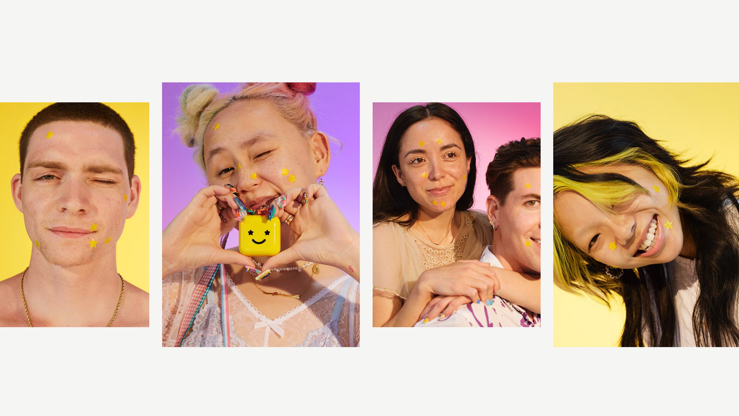
Every acne brand before Starface sold concealment. We positioned Starface as the opposite: a brand that treats a breakout as something to decorate, photograph and share. The patch is the product and the advertisement at the same time, worn on the face in public, on camera and on social.
That single shift, from hiding to showing, set the tone for everything that followed: the color, the character, the voice and the way the brand behaves online.
Identity: the yellow universe
We grounded the identity in one unmissable yellow, with Y2K design cues and a smiley-face logo whose eyes are stars. The logotype builds on Haley Fiege's Sniglet, redrawn with custom star-shaped counters so the stars live inside the letters as well as on the face. ABC Diatype Rounded from Dinamo and GT Pressura Mono from Grilli Type carry the voice across packaging, web and social.
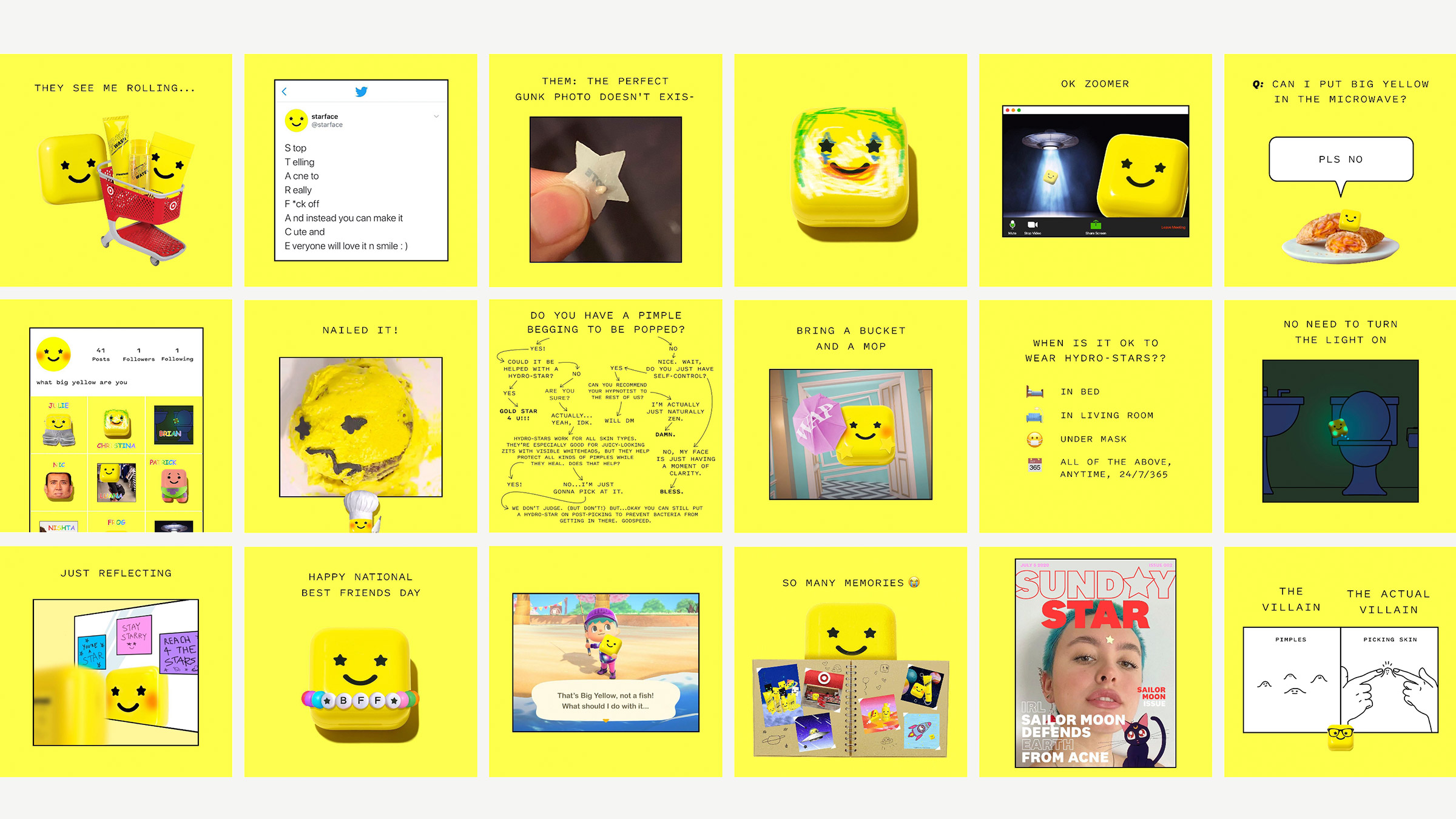
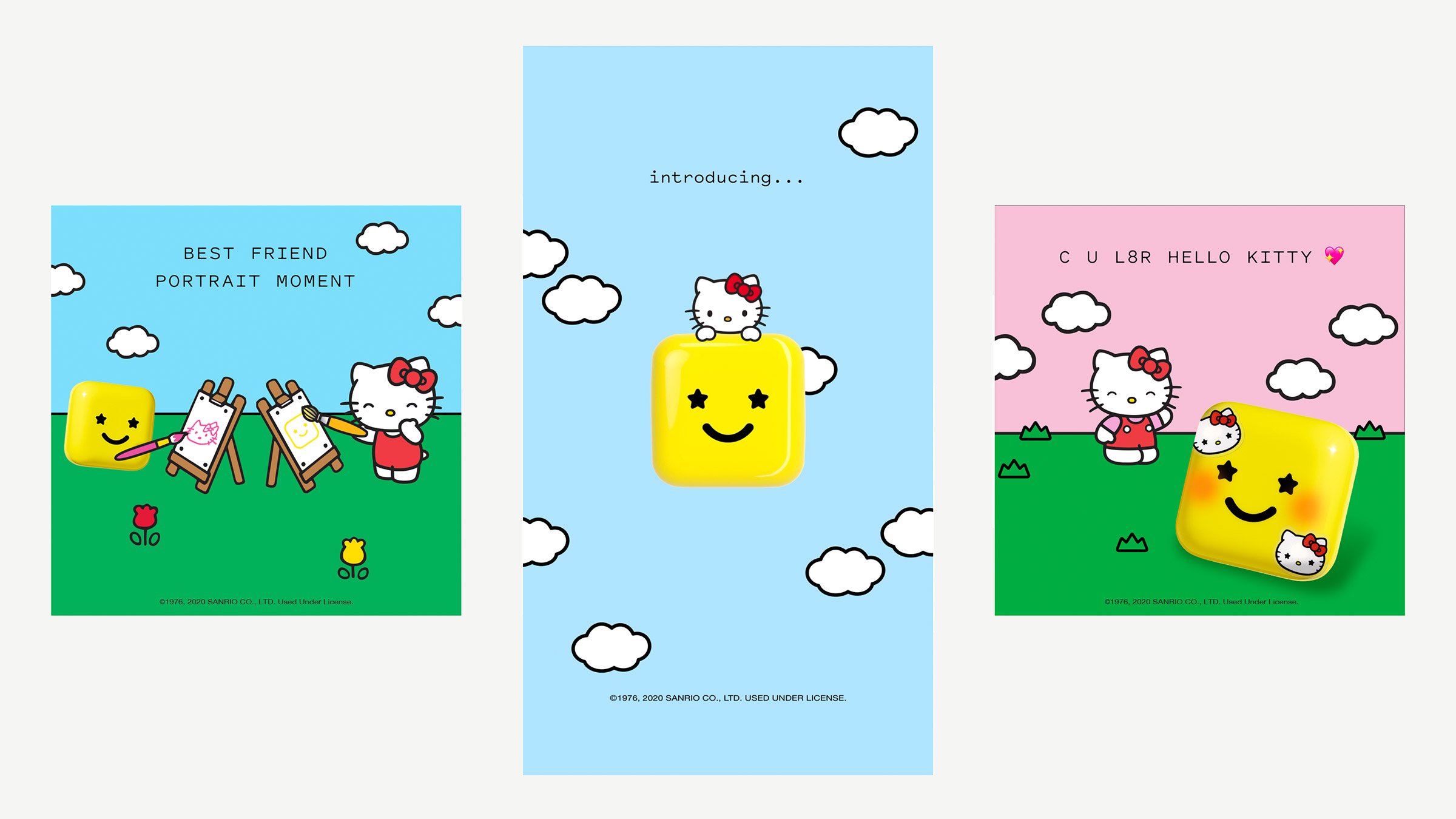
The compact itself became the mascot. Big Yellow, the star-eyed smiley case that holds the Hydro-Stars, is the main character of the brand's storytelling: it rides roller coasters, runs a book club and comments on the brand's posts from its own account. Giving the packaging a personality meant the brand could show up anywhere without a model, a product shot or a tagline.
Packaging and retail
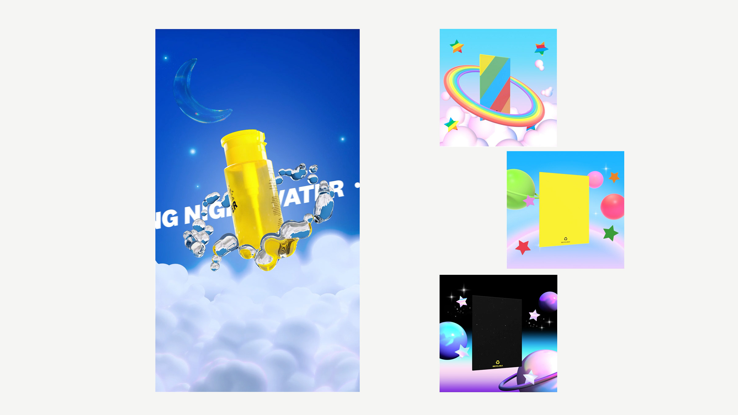
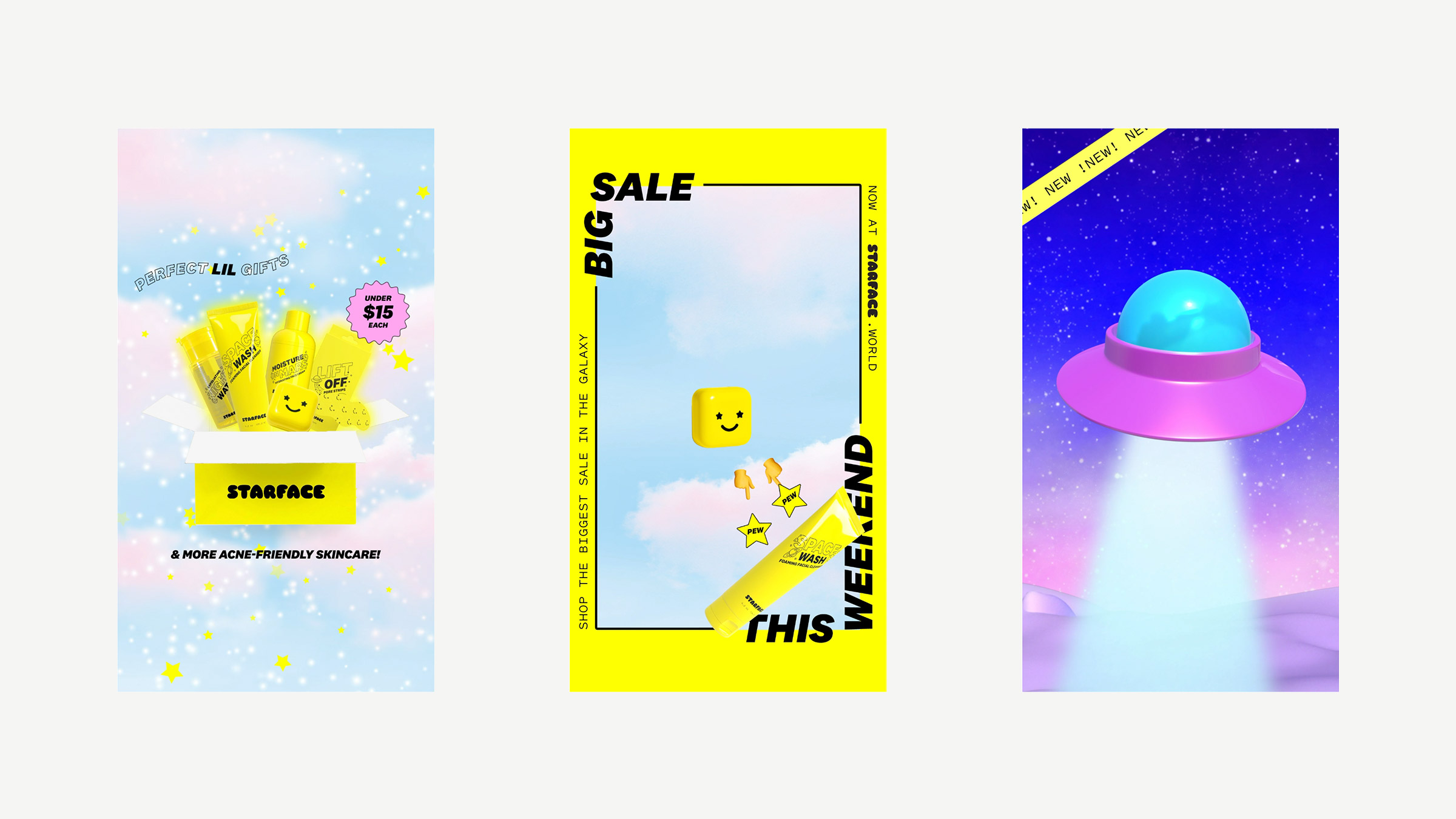
The Hydro-Star compact is a glossy yellow square with a star-eyed smile: recognizable at arm's length, at thumbnail size and on a shelf. We designed the packaging system around it, from the patches themselves to the recyclable cartons and the retail displays that took Starface into Target, Ulta and beyond. The product line grew inside the same world, and Space Wash, Moisture Mars, Lift Off and Night Water all speak the same visual language.
Digital, social and campaigns
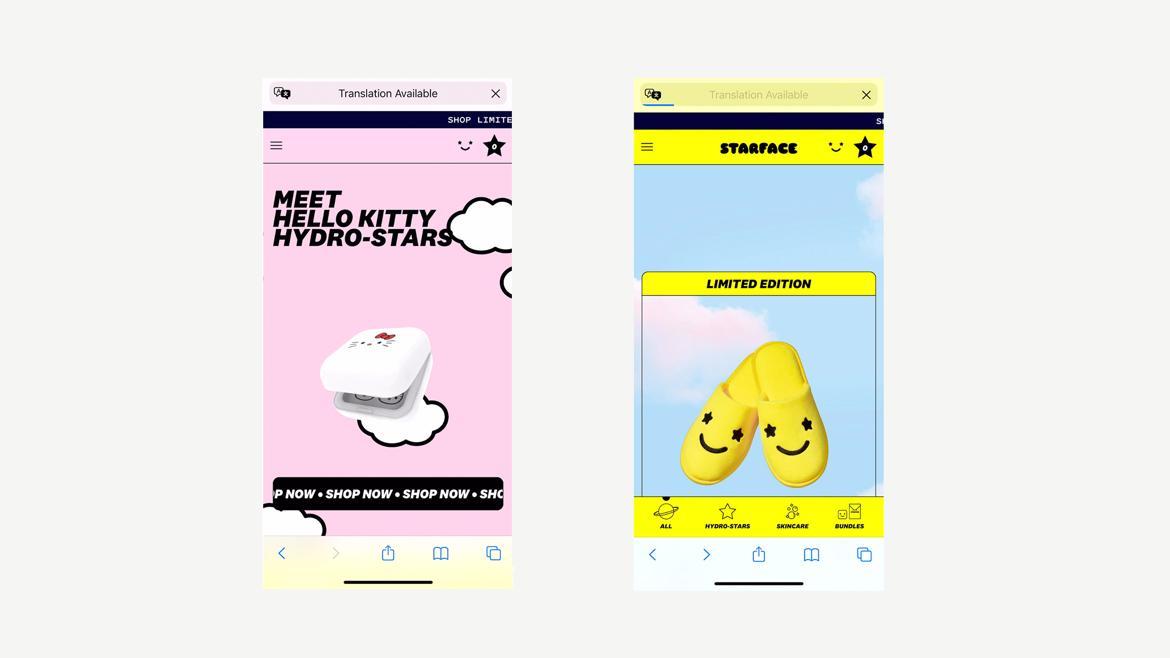
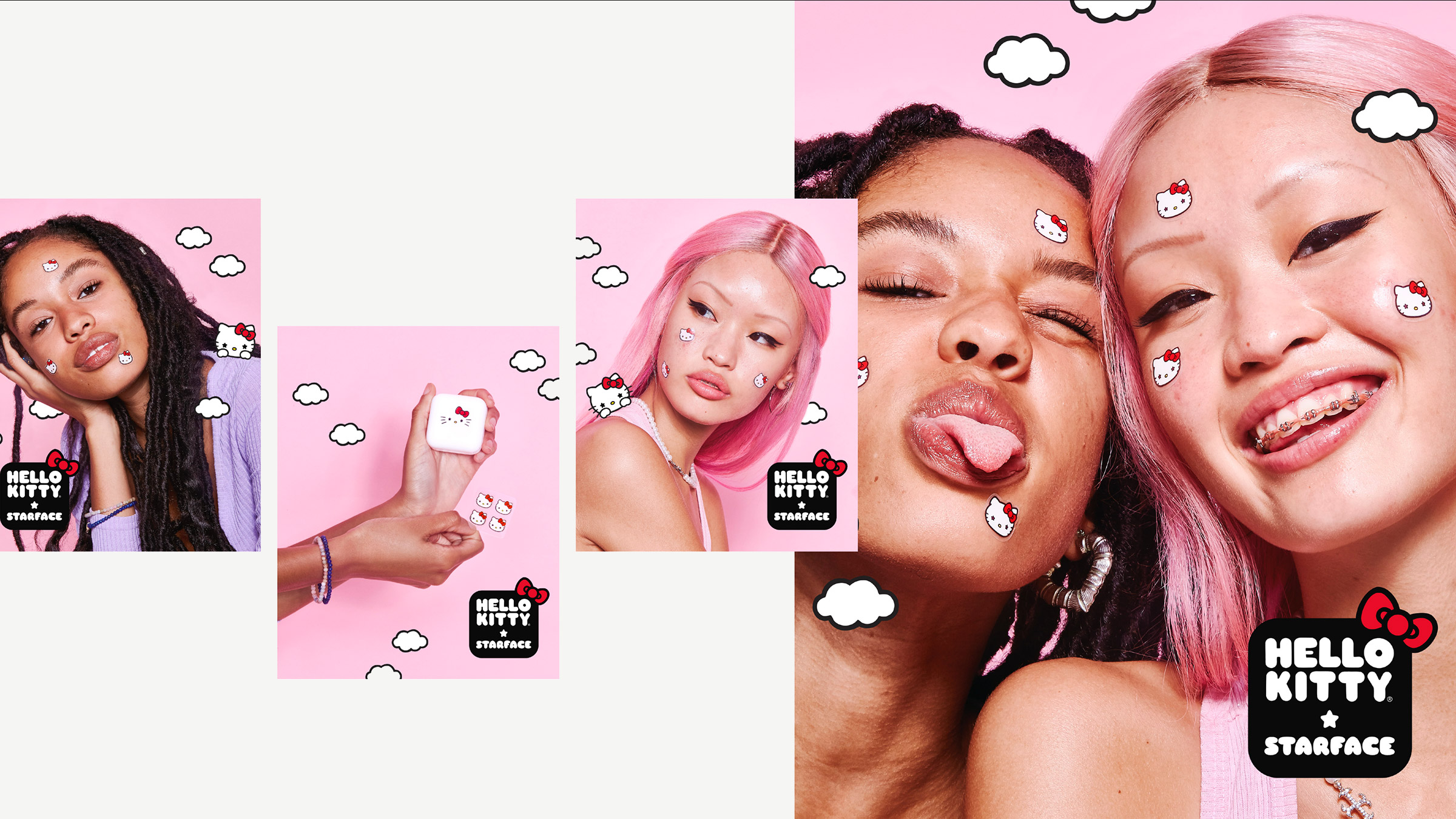
As creative partner for over two years we ran the brand across every touchpoint: the website, social content, paid ads, launch campaigns, decks, photo direction and retail. Social was built around Big Yellow's voice, dry, self-aware and very online, set in monospaced type that reads like a text from a friend. Collaboration launches, including Hello Kitty x Starface, extended the world without breaking it.
Results and recognition
Starface became one of the most culturally iconic brands of the last decade and a defining example of what a Gen Z brand looks like. The work won a Webby Award and a Shorty Award, and Big Yellow was recognized at the Shorty Social Good Awards. In 2024 CNBC reported that the business brings in roughly $90 million a year.
Starface's founders later partnered with us again to build Plus, the waterless body wash brand.
Frequently asked
Who designed the Starface brand?
Someone & Others, a cultural intelligence studio founded by Daniel Lowe, designed the Starface brand identity from the very beginning: the star-eyed smiley logo, the yellow Hydro-Star packaging, tone of voice, website, social and campaigns. The studio was Starface's creative partner for over two years.
Who created Big Yellow, the Starface mascot?
Big Yellow, the star-eyed smiley compact that holds Starface's Hydro-Stars, was created by Someone & Others as part of the original brand identity. The character became the main persona for the brand's storytelling on social media.
What typefaces does Starface use?
The Starface logo is based on Haley Fiege's Sniglet, customized with star-shaped counters. The brand's main typefaces are ABC Diatype Rounded by Dinamo and GT Pressura Mono by Grilli Type, used across packaging, web and social.
What did Someone & Others do for Starface?
Brand strategy and positioning, logo and visual identity, packaging, tone of voice, website, social content, paid ads, campaigns, photo direction, decks and retail displays, from the very beginning of the brand and for more than two years as its creative partner.